
REZILIENT
Patient experience
My role and responsibilities
product designer
UX Design · Information architecture · Interaction design · Visual UI design
What is Rezilient?
Rezilient is a healthcare service that offers unlimited primary and specialty care through a combination of CloudClinics and telehealth, all for a single, predictable fee paid by employers.
The challenge
The challenge
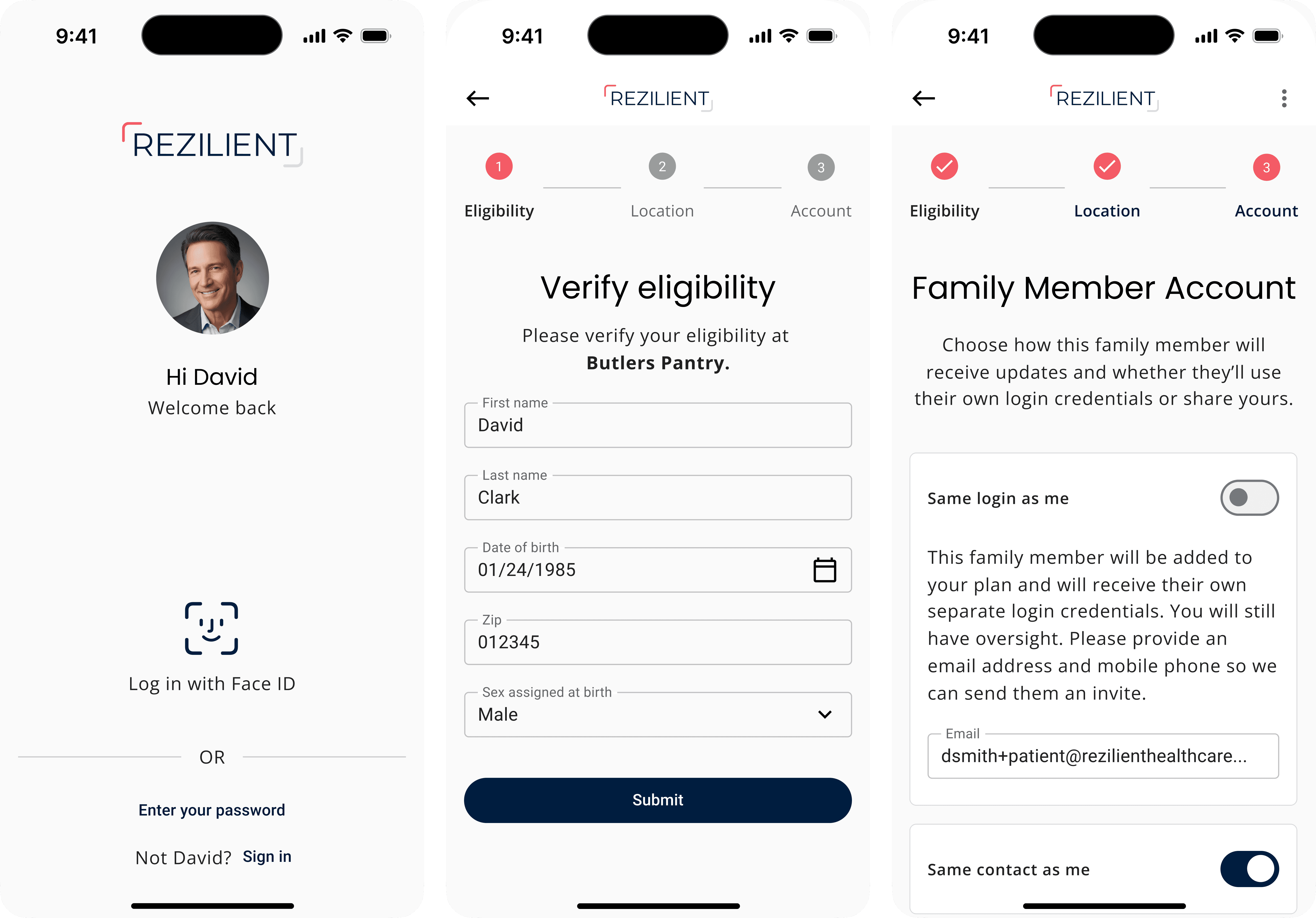
How might we create a patient experience that is intuitive, efficient, and educational, helping patients and their families quickly access the right care (telehealth or in-office)
How might we create a patient experience that is intuitive, efficient, and educational, helping patients and their families quickly access the right care (telehealth or in-office)
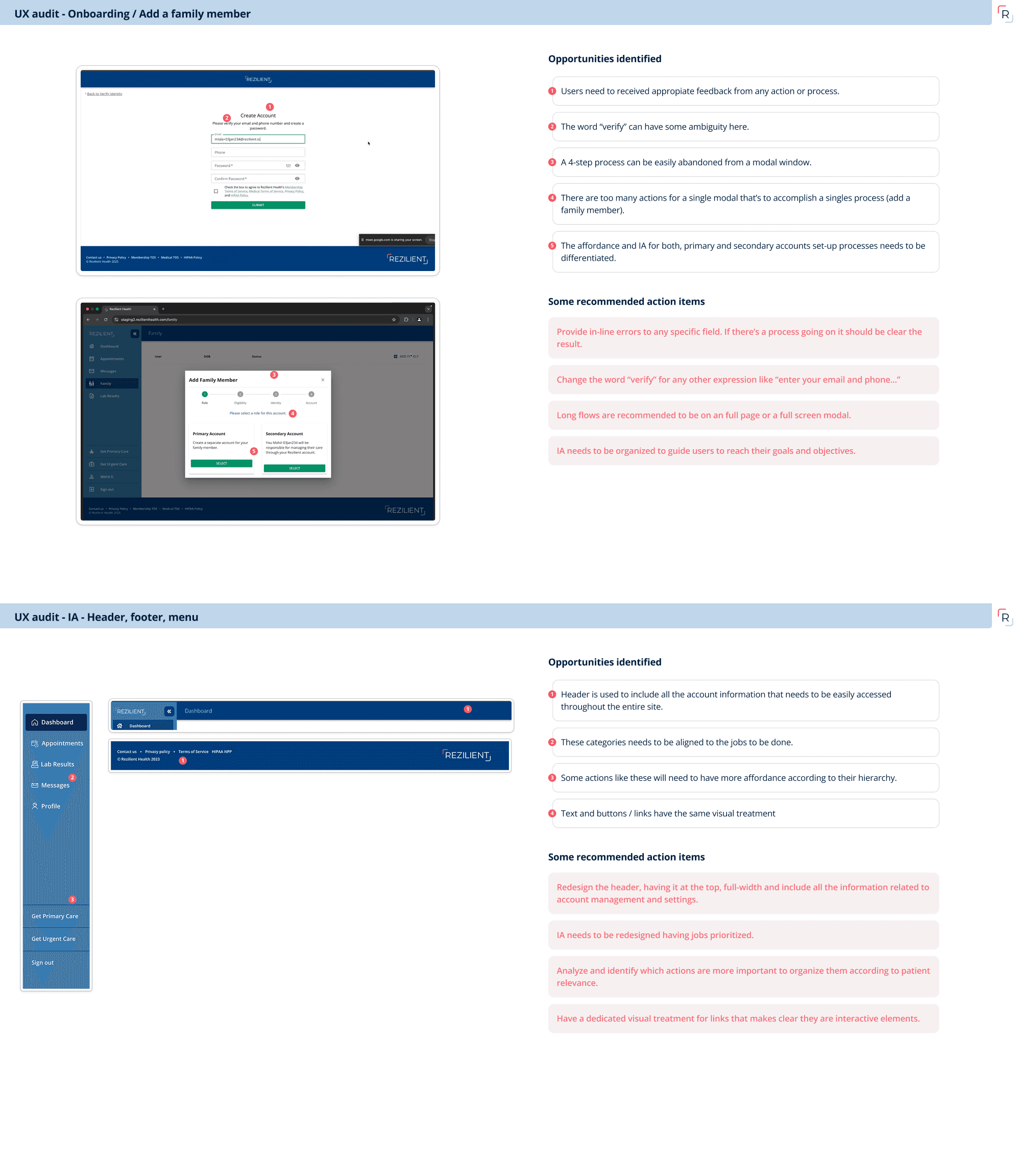
Stakeholders alignment: Audit what’s existing and recommend enhancements
Stakeholders alignment: Audit what’s existing and recommend enhancements
Stakeholders alignment: Audit what’s existing
and recommend enhancements
The stakeholders wanted to redesign the patient experience on their platform and launch in a couple of weeks but they weren’t sure what they needed to fix. That’s why I initially audited the live site and suggested some important IA and UX fixes and get them onboard on the plan.
The stakeholders wanted to redesign the patient experience on their platform and launch in a couple of weeks but they weren’t sure what they needed to fix. That’s why I initially audited the live site and suggested some important IA and UX fixes and get them onboard on the plan.
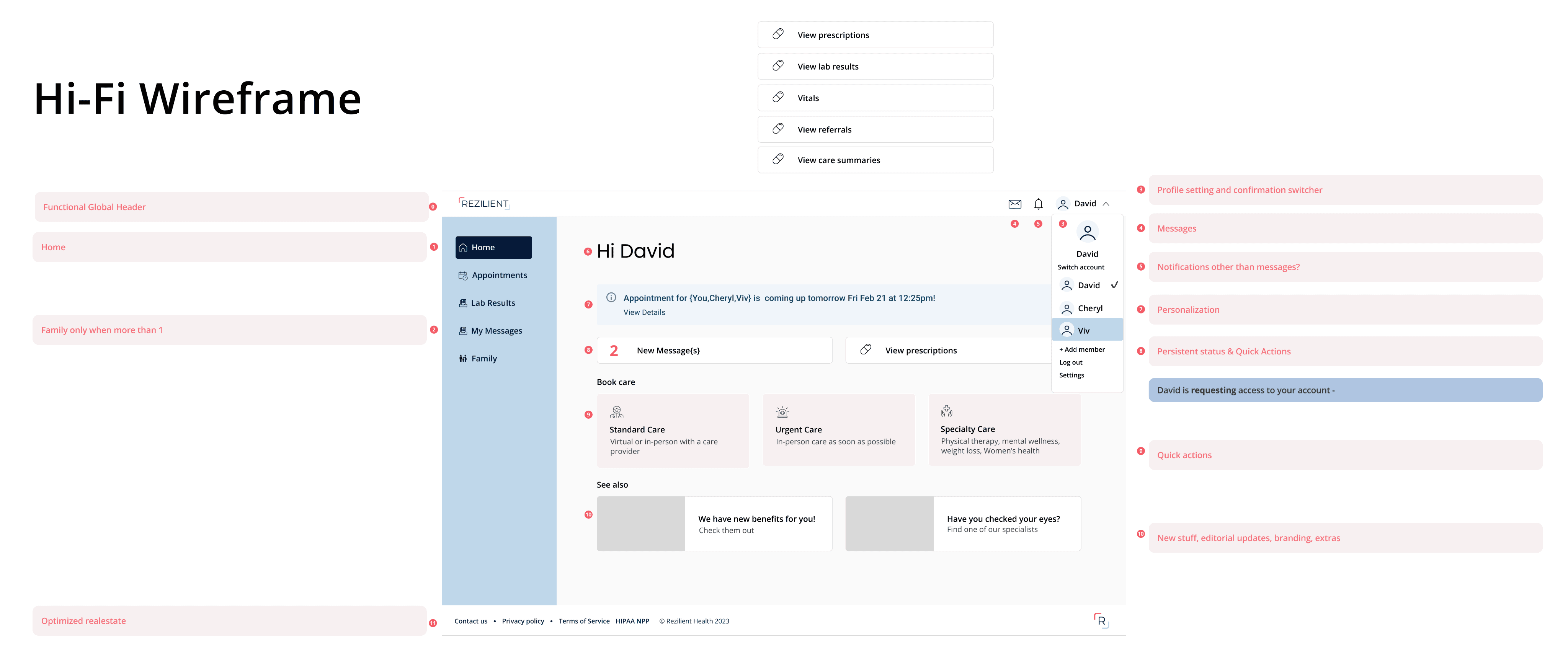
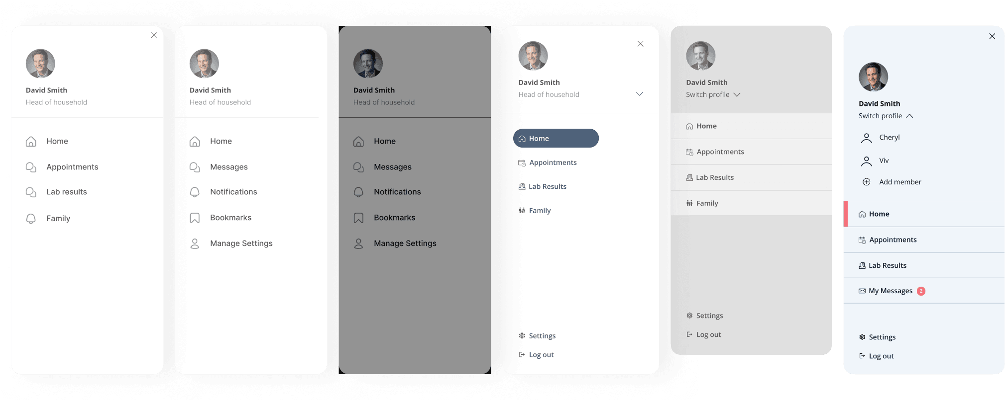
Information architecture exploration / wireframing
Information architecture exploration / wireframing
Then started understanding the current information architecture, taxonomy and got hands on wireframes, incorporating ongoing feedback from stakeholders to make sure we were aligned at every step.
Then started understanding the current information architecture, taxonomy and got hands on wireframes, incorporating ongoing feedback from stakeholders to make sure we were aligned at every step.
Information architecture exploration /
wireframing

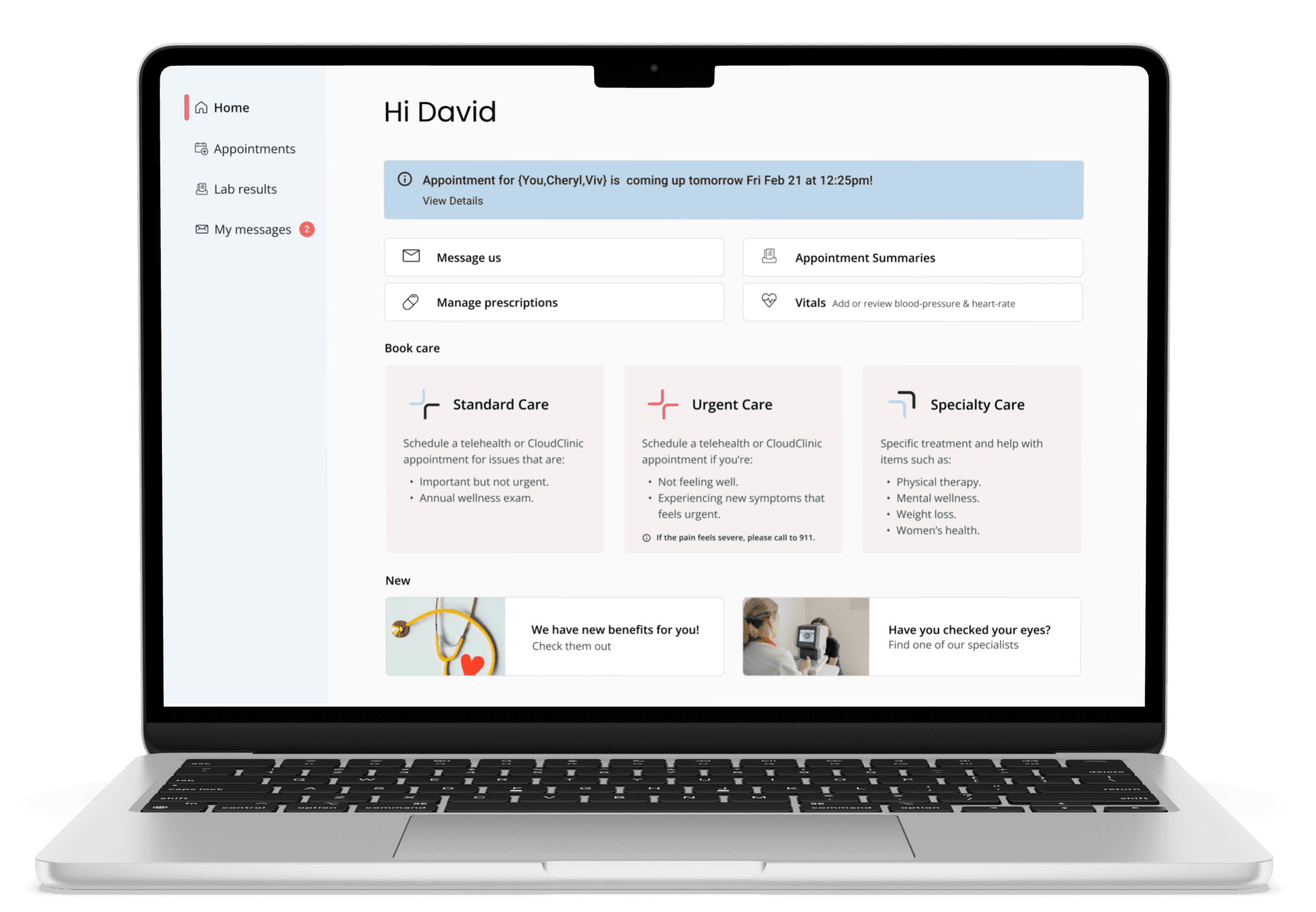
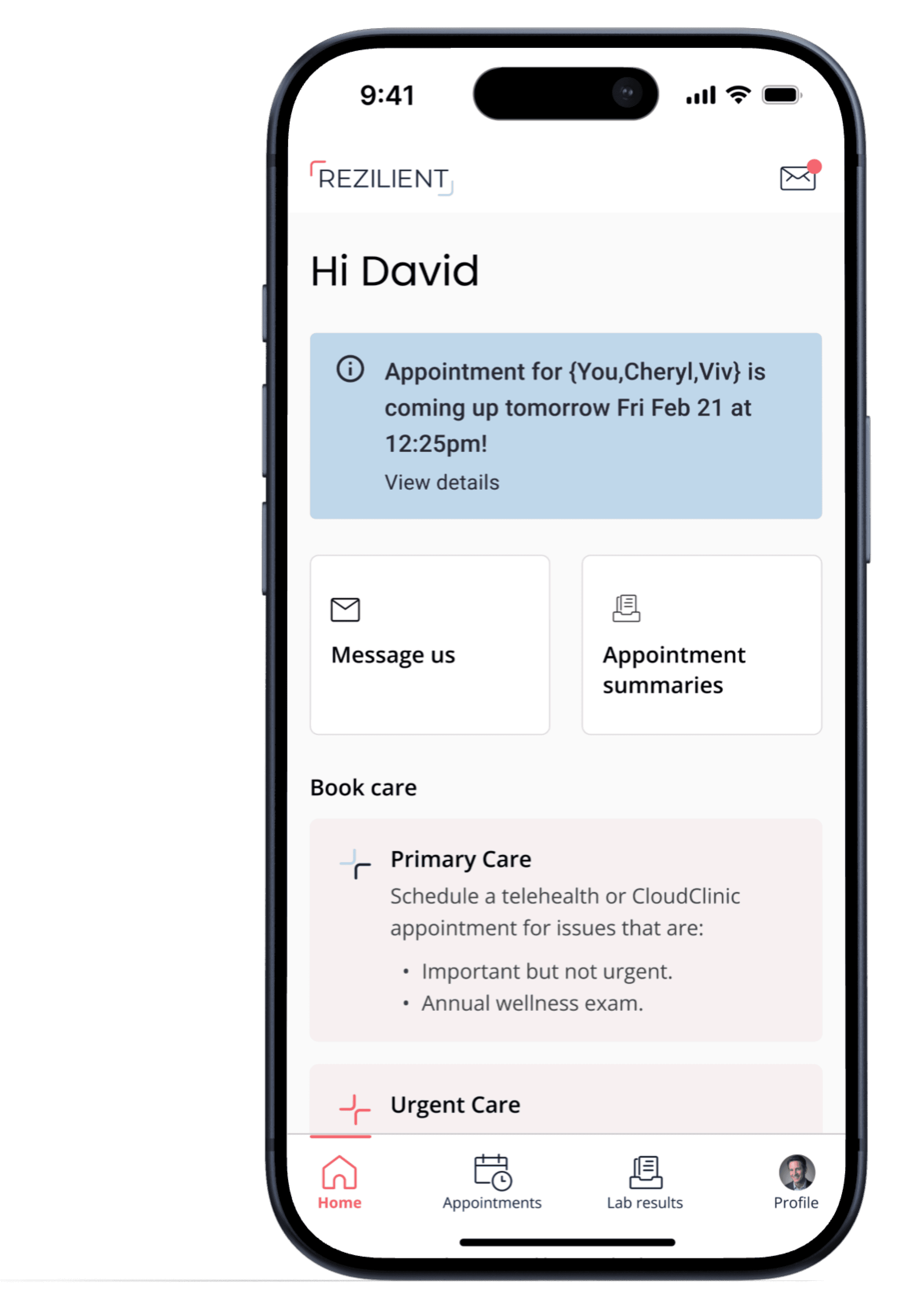
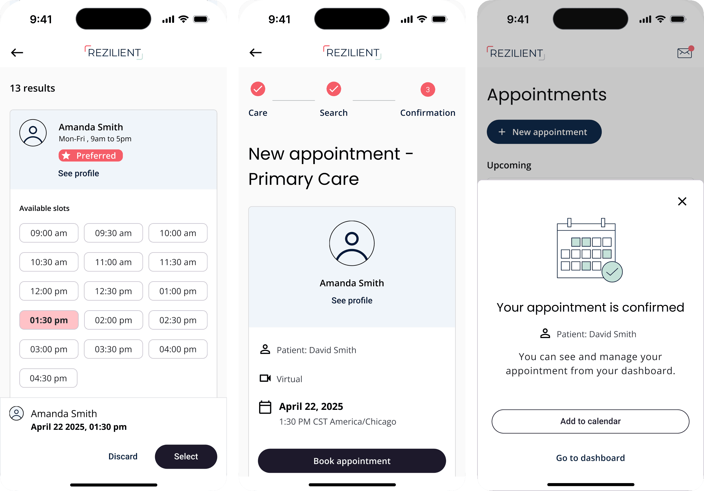
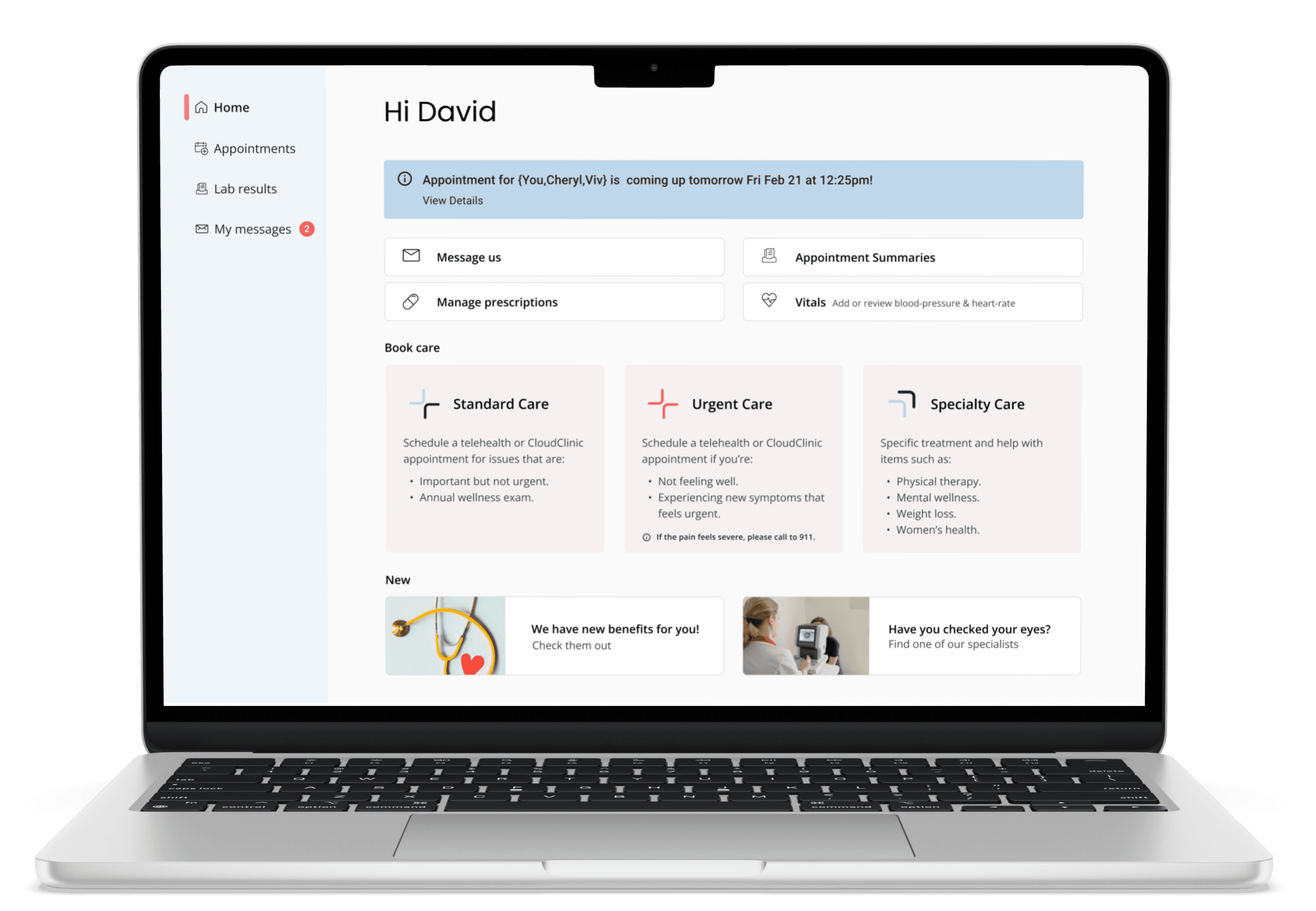
The product
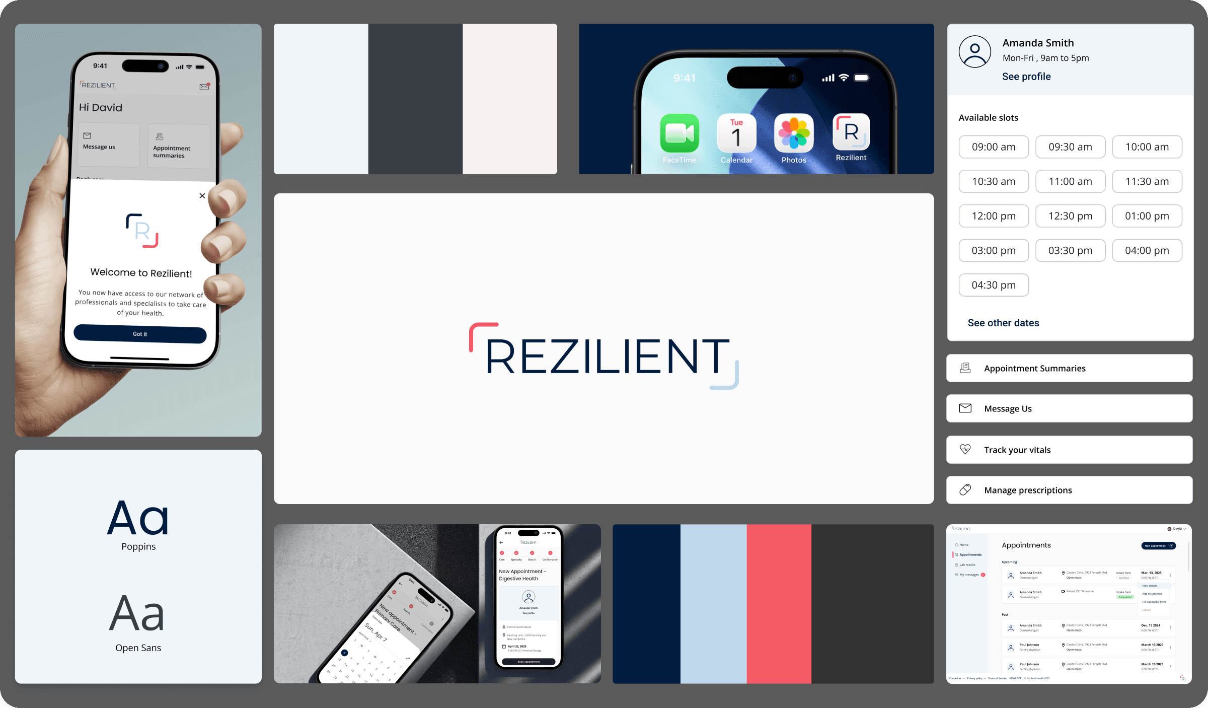
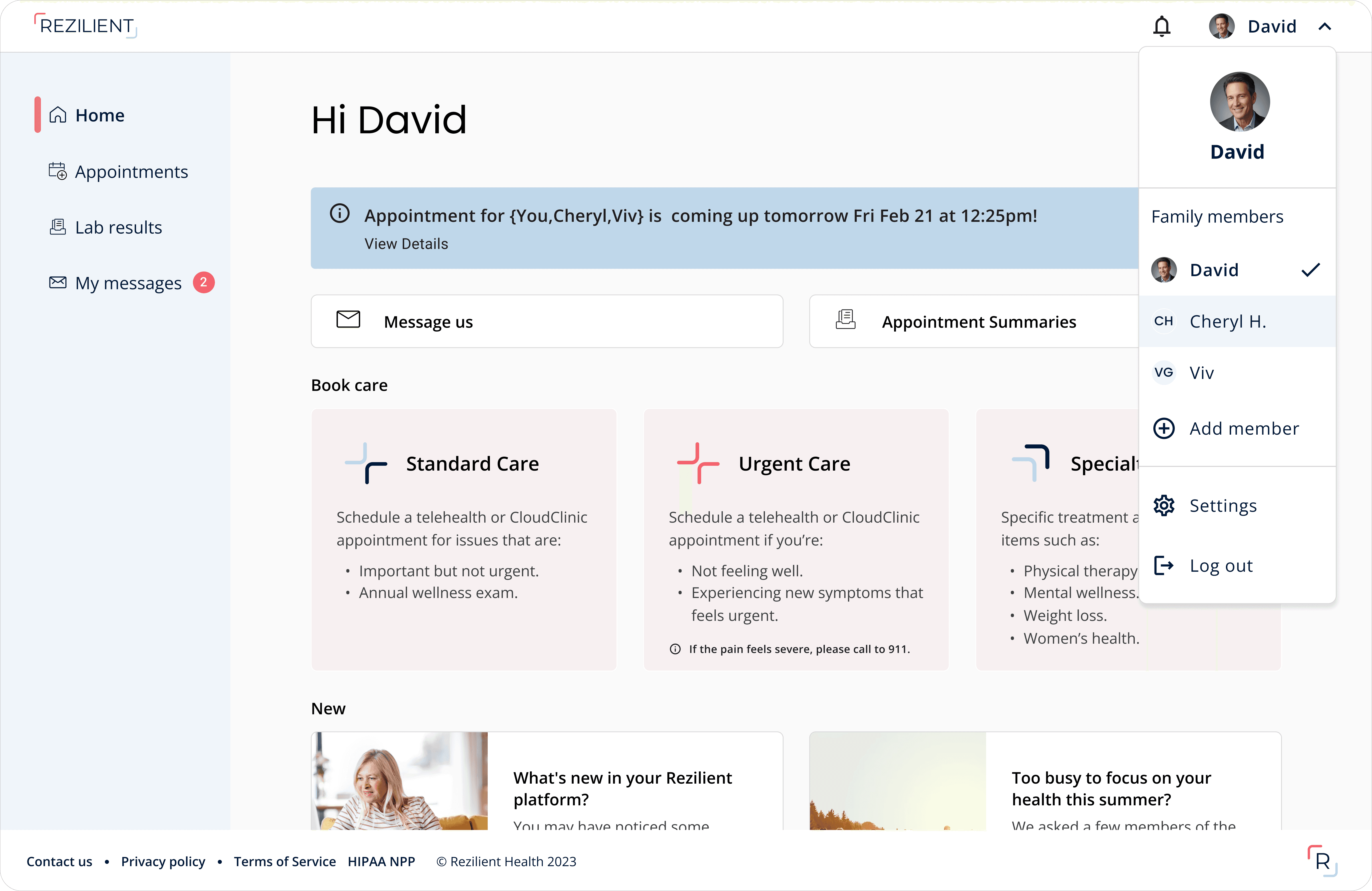
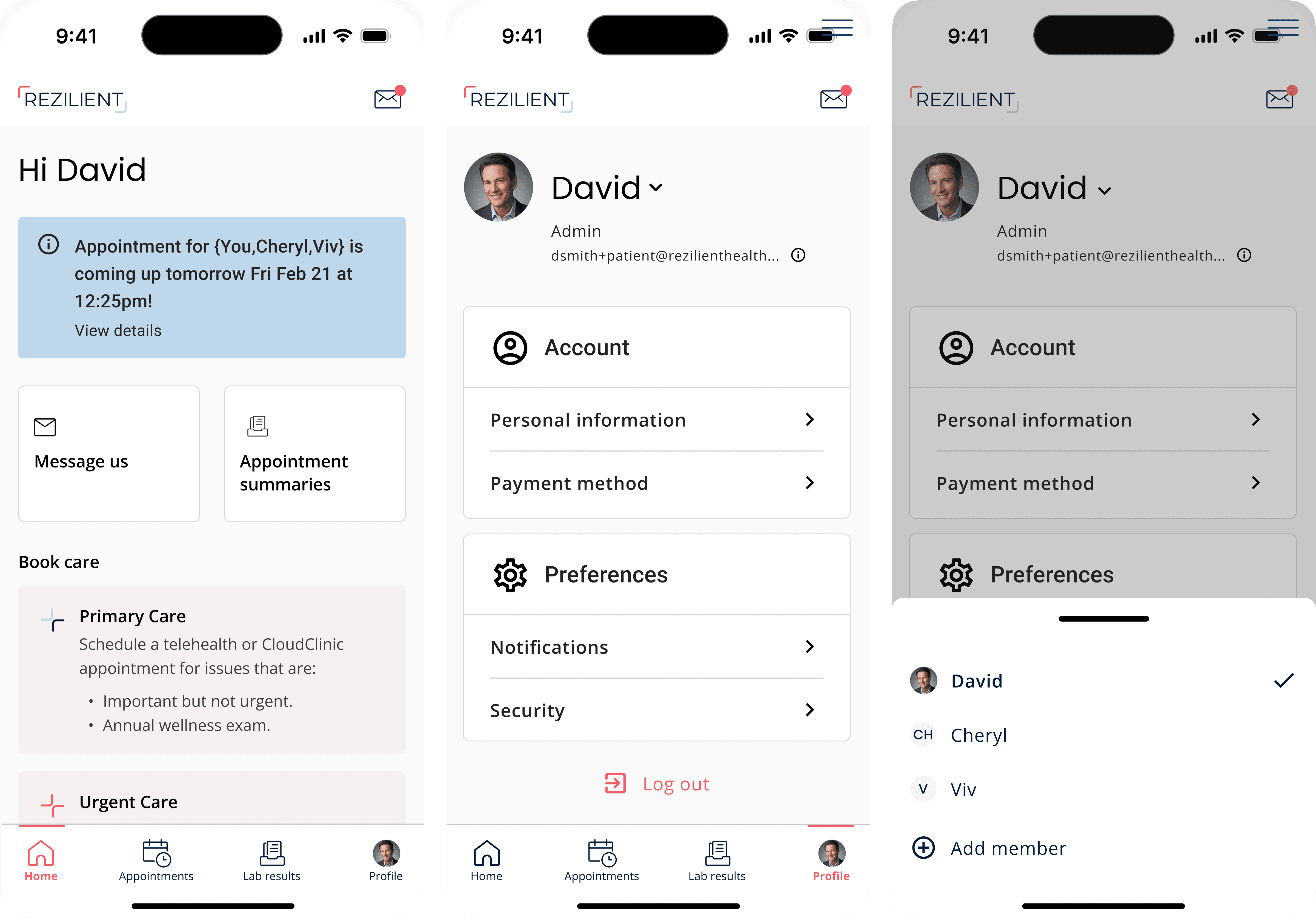
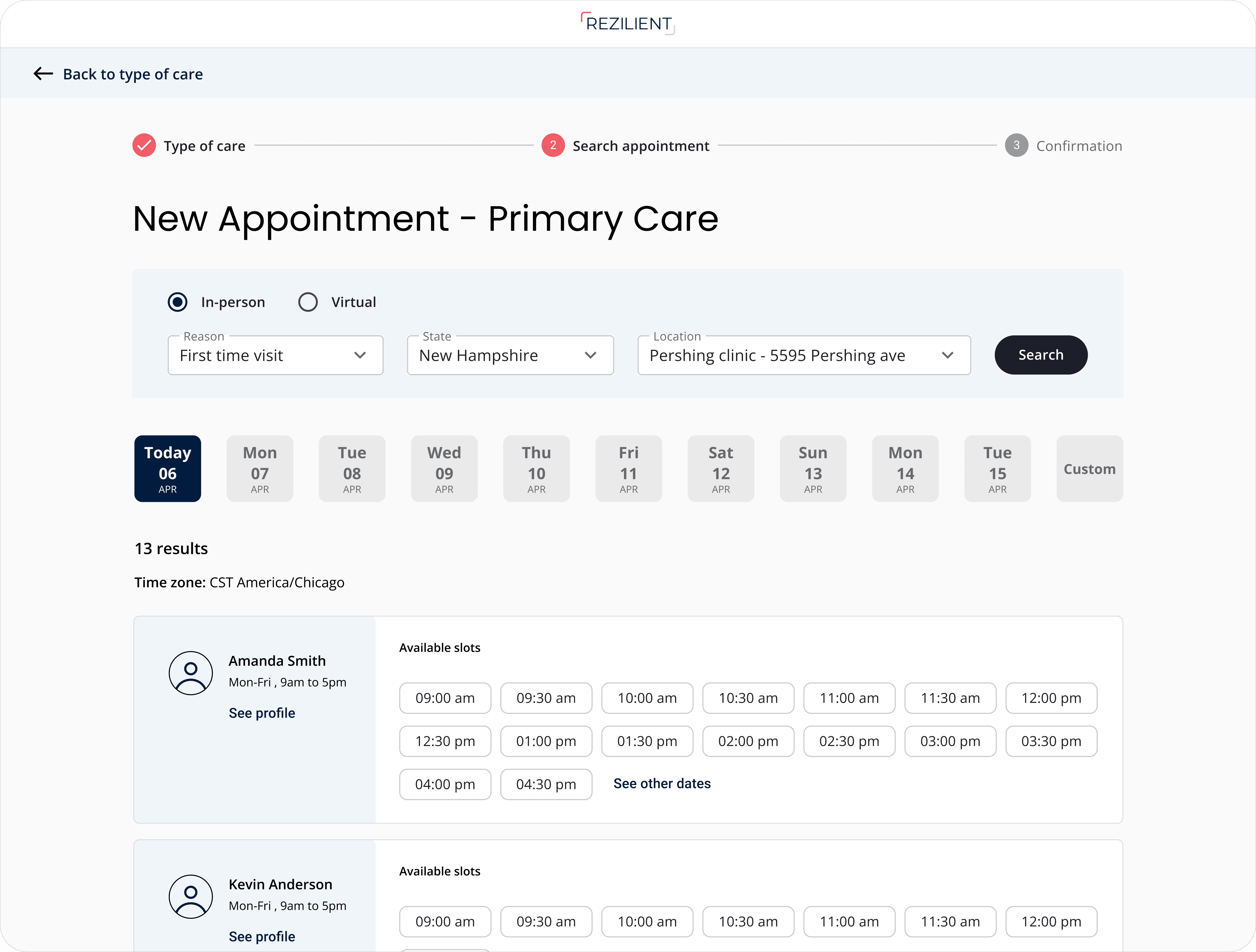

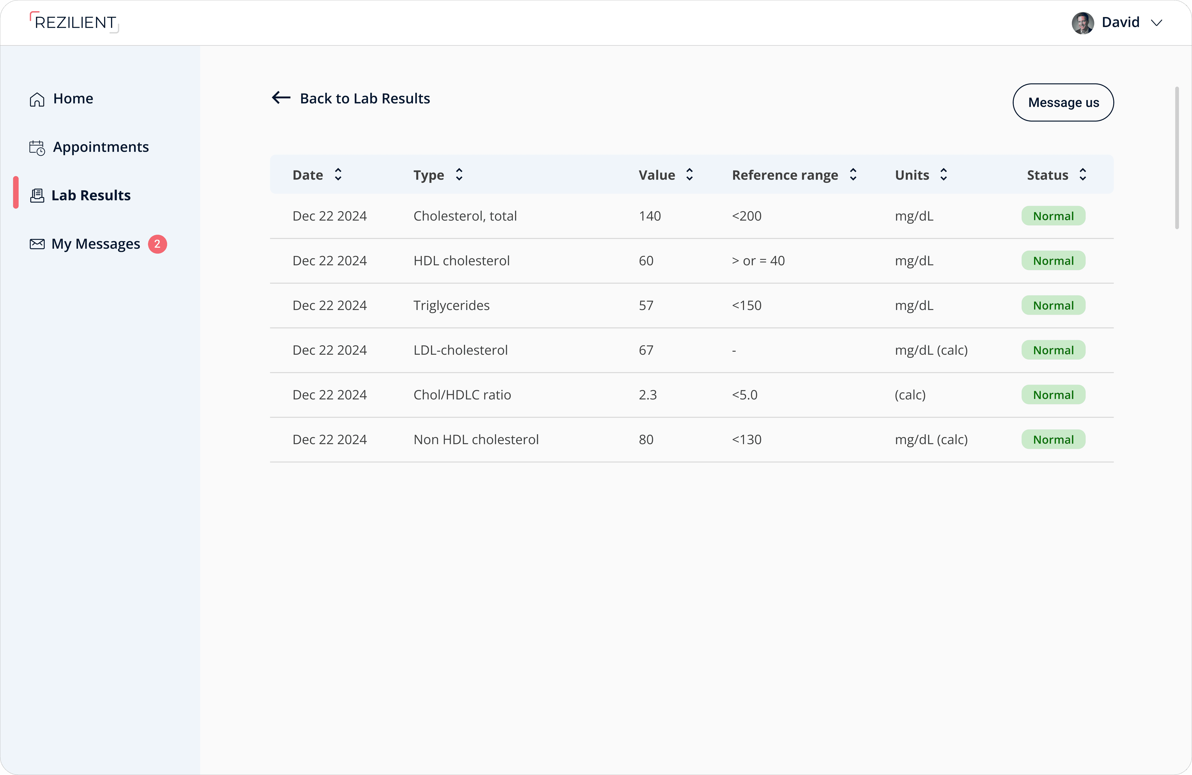

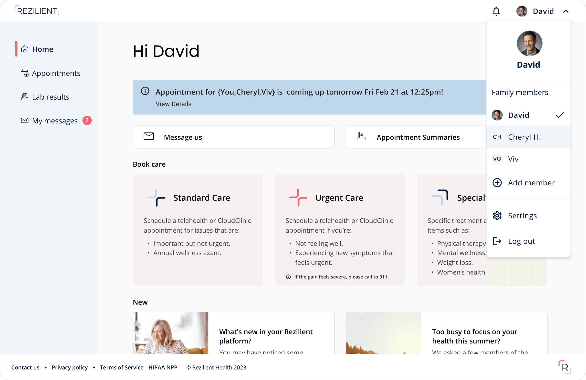
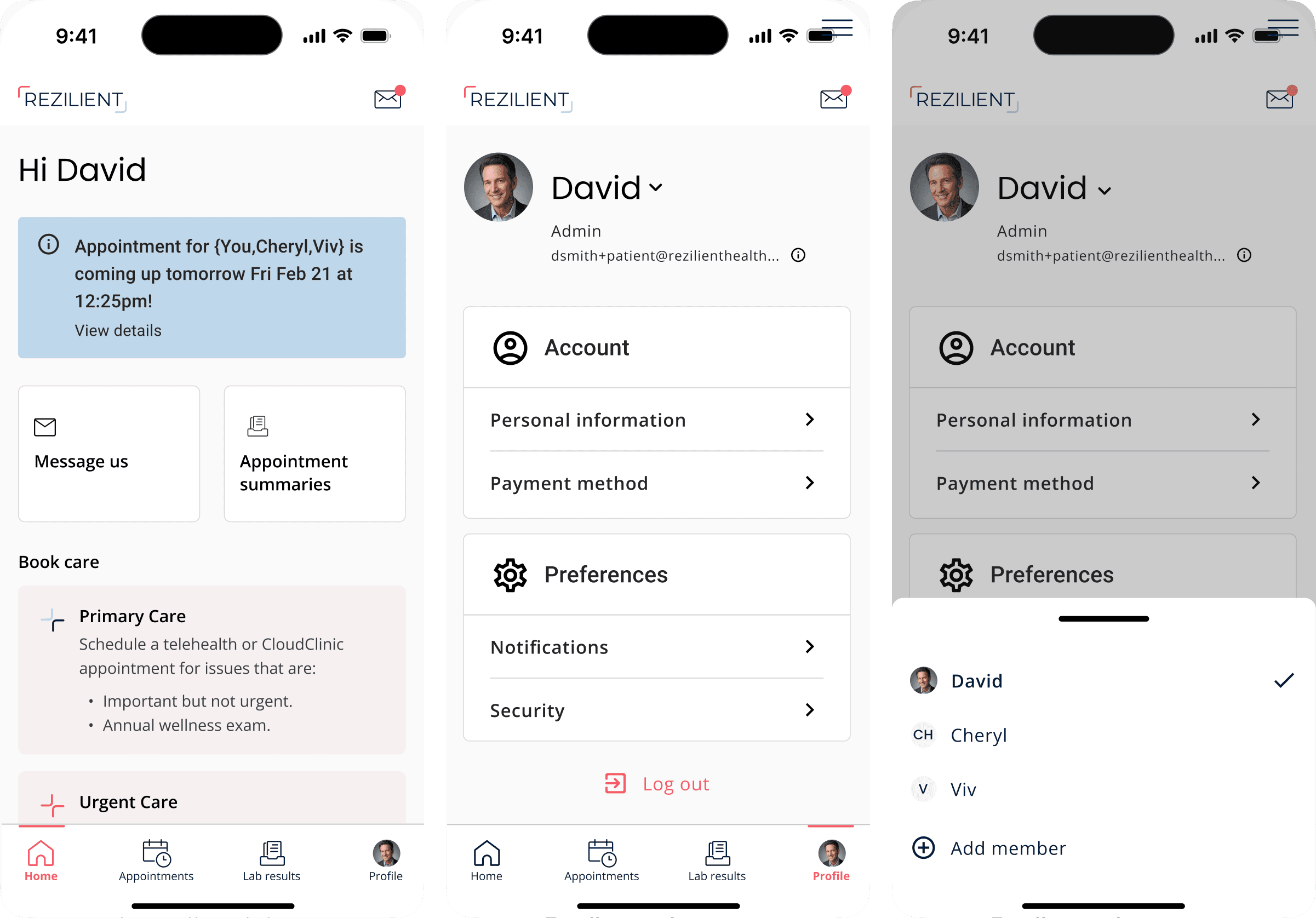

The product

Let’s collaborate!
Let’s collaborate!
Let’s
collaborate!
REZILIENT
Patient experience
My role and responsibilities
product designer
UX Design · Information architecture · Interaction design · Visual UI design
REZILIENT
Patient experience
My role and responsibilities
product designer
UX Design · Information architecture · Interaction design · Visual UI design
What is Rezilient?
Rezilient is a healthcare service that offers unlimited primary and specialty care through a combination of CloudClinics and telehealth, all for a single, predictable fee paid by employers.